Setup:
Go to the Template folder, and open up 'multi.html'
Copy all of the code in this file.
Go to the Page folder, and create a new file.
Name the file what you want to have appear at the end of the URL.
Paste the code in the new file.
Differences:
The first two sections are the same as in a single image page.
The main difference is that a div id called 'two-column' is used instead of 'page'.
Captions are also put outside of this div id, instead of within it.
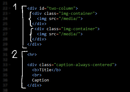
1. Images
On desktop, <div id="two-column"> will display every <div class="img-container"> ... </div> in a two column grid.
On mobile, it collapses into one column.
You can change <div id="two-column"> to <div id="three-column"> to use a three column layout on desktop. It will also collapse to one column on mobile.
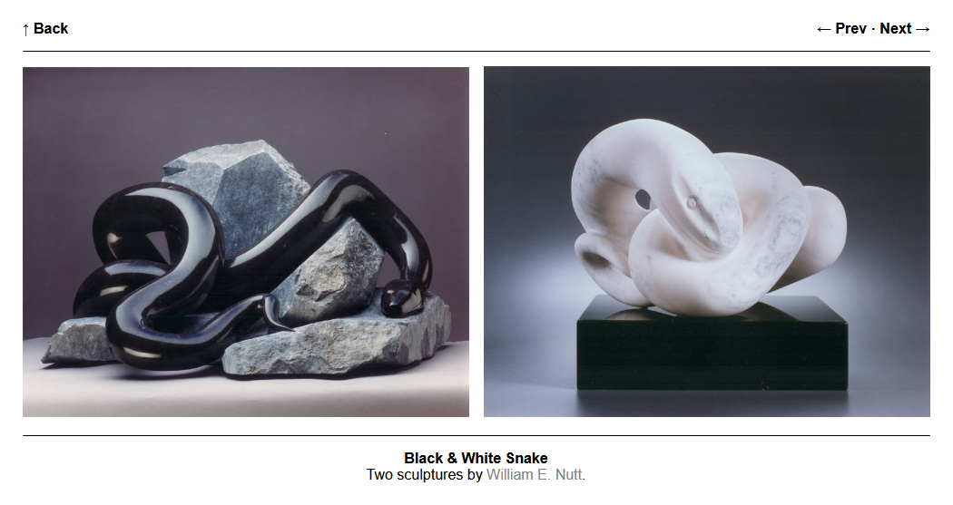
The page for William E. Nutt uses the two column layout.
2. Caption
In the template, <div class="caption-always-centered"> ... </div> goes underneath the images.
If you want to move the caption to the top, cut and paste that code to be above <div id="two-column">. Make sure to cut and paste the <hr> divider as well, placing it between the caption and the images.
A scenario where you might want the caption up top is if you want some information to appear before a long comic.
You can also remove the caption and divider entirely.
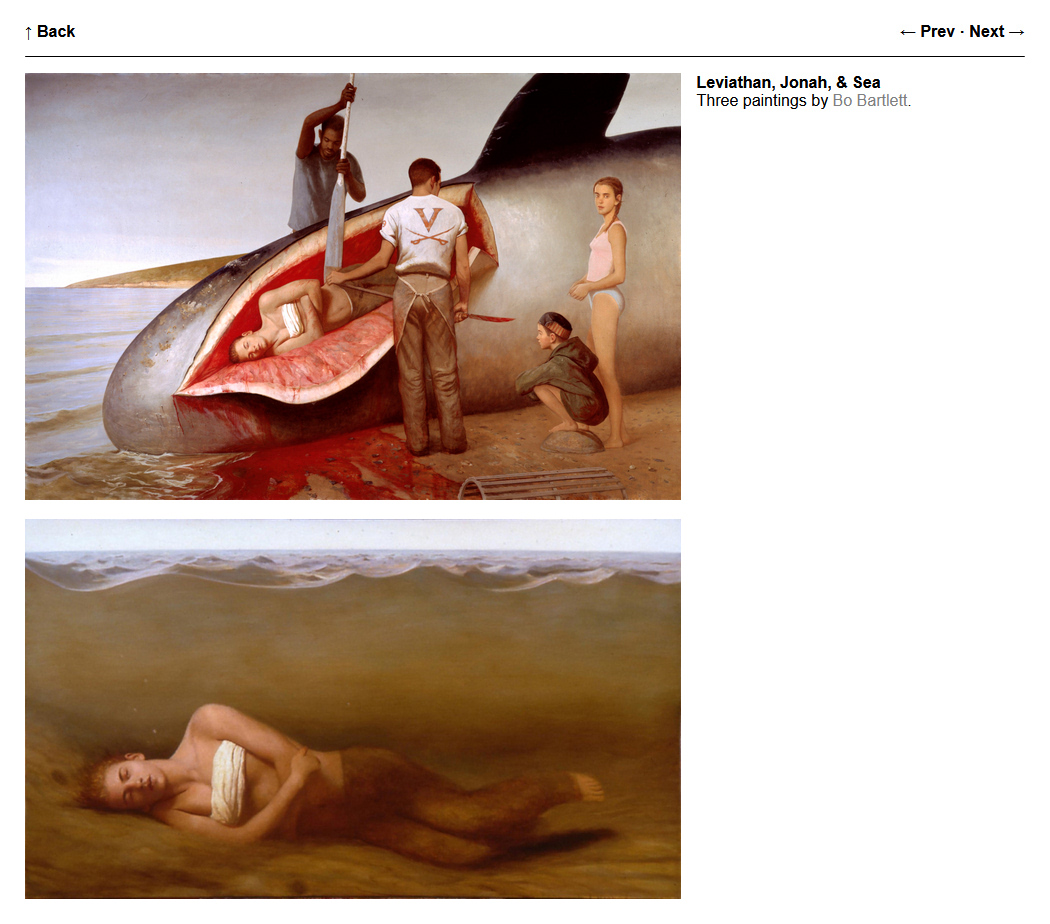
Multiple images in one column, with a caption to the side:
Another way to create a multi-image layout is to use the single page template, but with multiple images within <div class="img-container"> ... </div>.
Here's an example of that:
<div class="img-container">
  <img src="/media/image1.jpg">
  <p><img src="/media/image2.jpg"></p>
  <p><img src="/media/"image3.jpg></p>
</div>
This is what the page for Bo Bartlett uses.
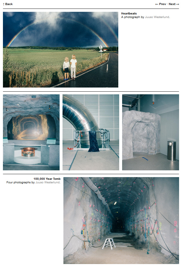
More advanced layouts:
If you want something more complicated, you can mix and match divs.
Here's the code used in the page for Juuso Westerlund, but with URLs and caption information removed:
<!-- First Section -->
<div id="page">
  <div class="img-container">
    <img src="/media/">
  </div>

  <div class="caption">
    <hr class="page-divider">
    <b>Title</b>
    <br>
    Caption
  </div>
</div>

<hr>

<!-- Second Section -->
<div id="three-column">
  <div class="img-container">
    <img src="/media/">
  </div>
  <div class="img-container">
    <img src="/media/">
  </div>
  <div class="img-container">
    <img src="/media/">
  </div>
</div>

<hr>

<!-- Third Section -->
<div id="page-flipped">
  <div class="caption">
    <b>Title</b>
    <br>
    Caption
  </div>

  <div class="img-container">
    <hr class="page-divider">
    <img src="/media/">
  </div>
</div>
This example uses a new div id called 'page-flipped', which does two things on desktop views:
- Aligns caption text to the right
- Makes the column on the right wider than the one on the left
On mobile, page-flipped collapses down to one column, and caption text is centered.
Text within <!-- ... --> is a code comment, and will not appear on the page.